For this project, I was doing something a bit unusual for me: print design. Always wanted two adverts for a magazine, so I needed to create PDF filea that could be printed by a printer. So not only did this project test my ability to create a static design, it also meant I needed to know lots of print processes e.g. knowing about marks and bleeds, outlining fonts, etc.
I built the designs in Illustrator, saving the images I needed in CMYK format in Photoshop and then importing them into Illustrator as links. The brief was clear in terms of what I needed to display on the pages, so it was a case of putting it all on there and then using design elements from the Always brand to bring them all together.
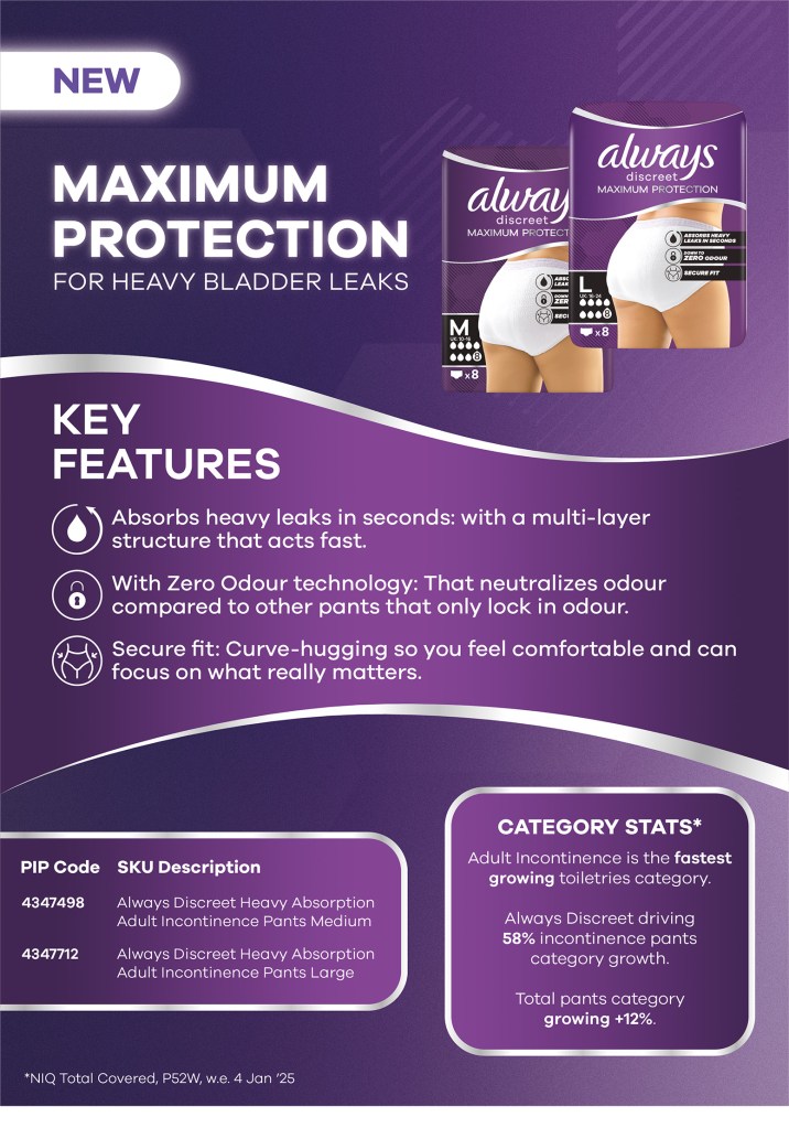
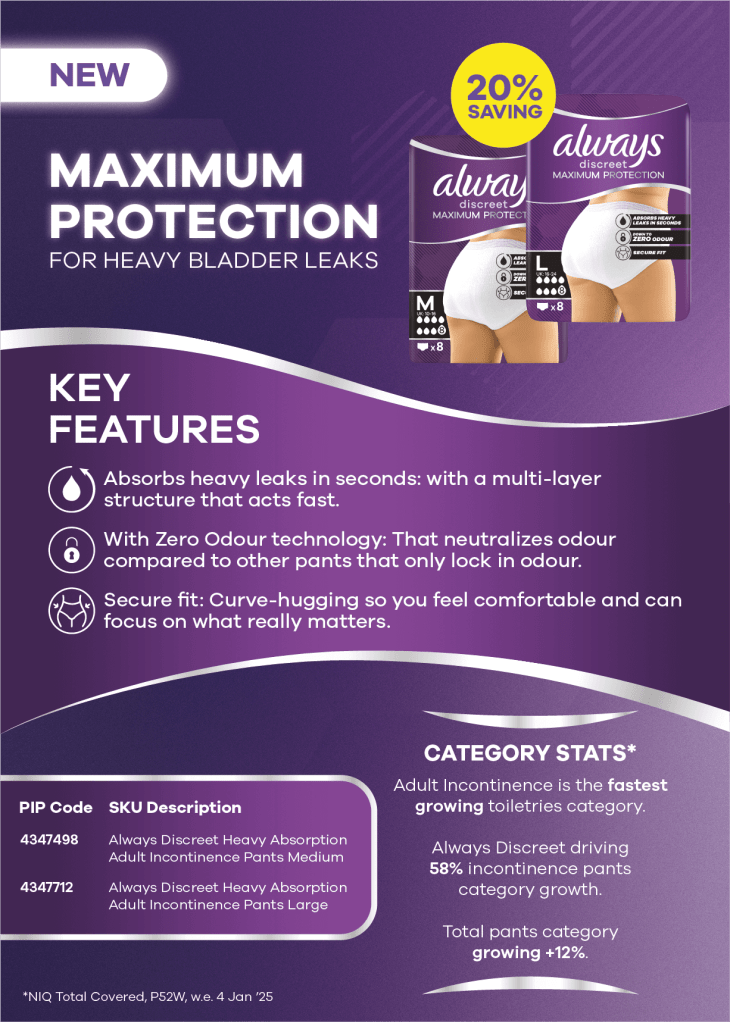
For the first of the designs, I really liked the wavy line shape used in the packaging, so I decided to recreate that and use it as the signature section of the design.
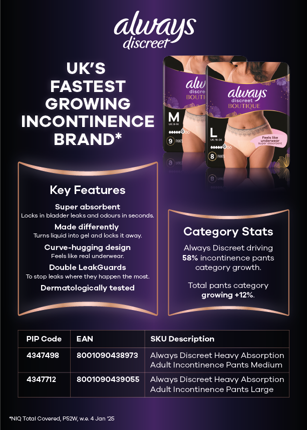
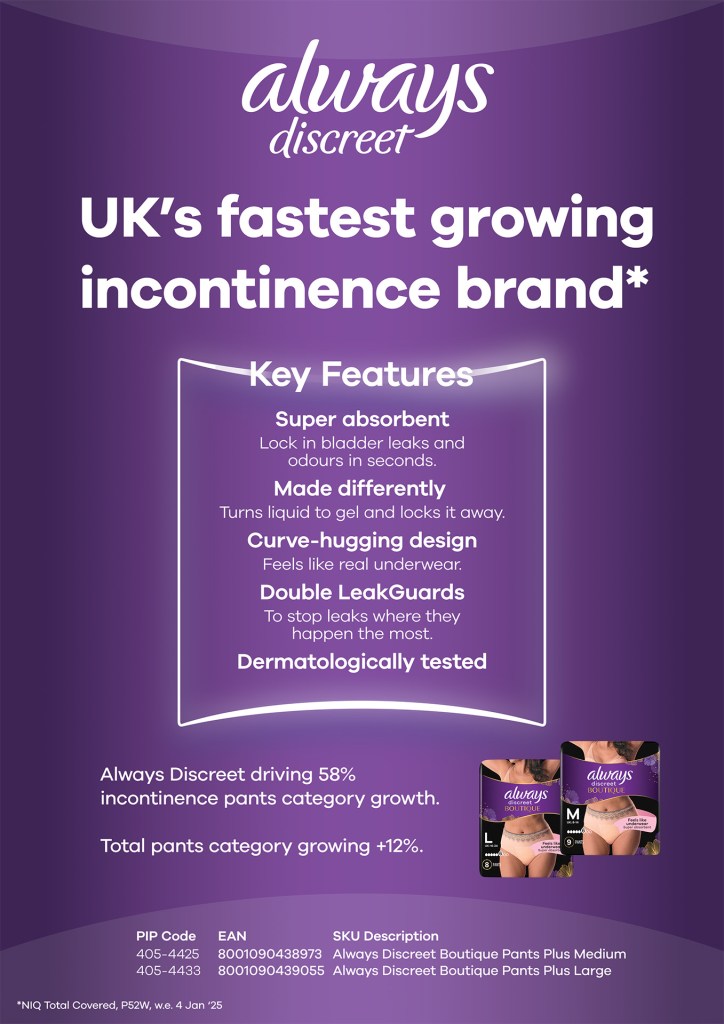
With the second design, this was their Boutique version and carried a more premium feel, so I used darker colours contrasted with a gold version of their fearless frame.
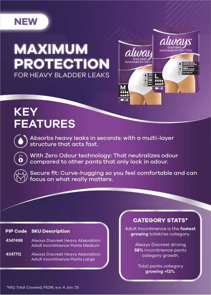
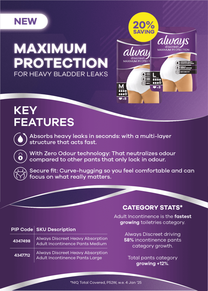
I created a few different versions for both of the designs, which you can see below. For the first design, I was happy with the upper half of the design, but the bottom took a few attempts to find somethat both myself and the client were happy with. We eventually opted for the first of the three designs below, which was tweaked a little more before becoming the final design shared above.
With the second design, I originally started on a similar colour design to the previous advert. There was some back and forth about the content which eventually lead to me using some different styles and moving to the darker design, which I feel worked much better in the end.
This was a fun project to get my teeth into and I learnt a lot about print design, which opened me up to doing various other print design work and creating a lot more static imagery, which was a great way to improve my design skills and link it all back into my motion design. The client was happy with the advert, and it was printed in the magazine successfully.
