In my Design Bootcamp course I took through the School of Motion, I was challenged to create a set of style frames for a 30 second TV advertisement. I was required to first produce two different style frame options with corresponding image references/mood boards, and then to produce full set of six style frames from my chosen option. The purpose of this exercise was to think about producing different styles and feelings for the same project, providing directional choices and helping to dial in the final look from those. This process is known as bracketing.
Initial Research
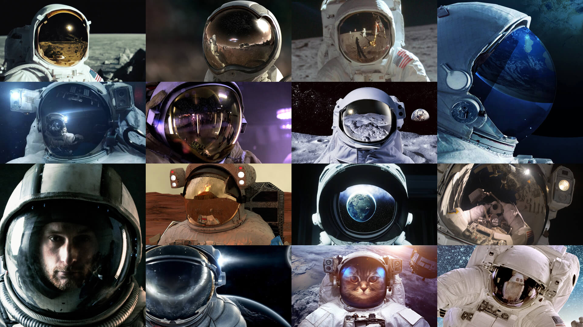
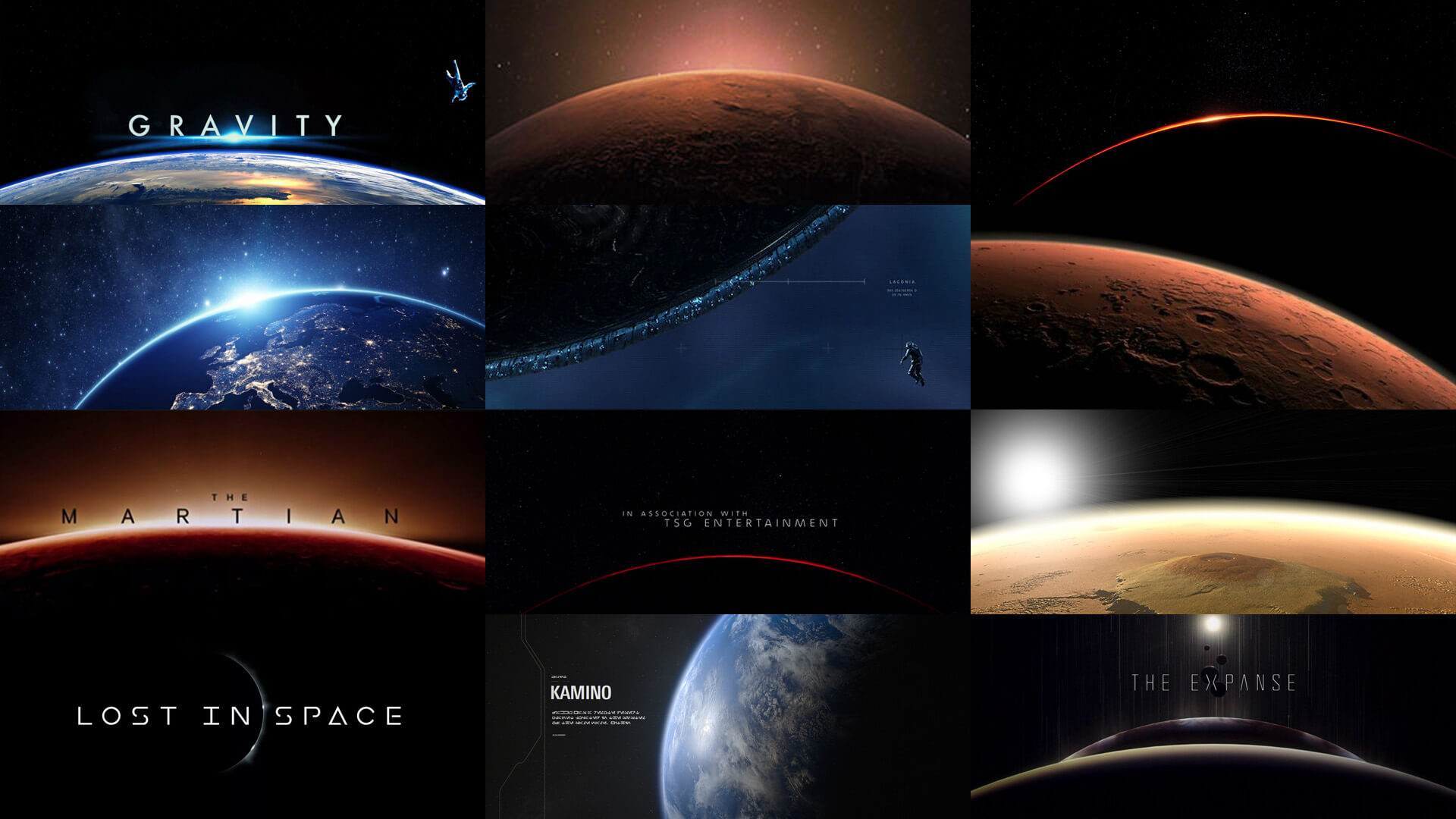
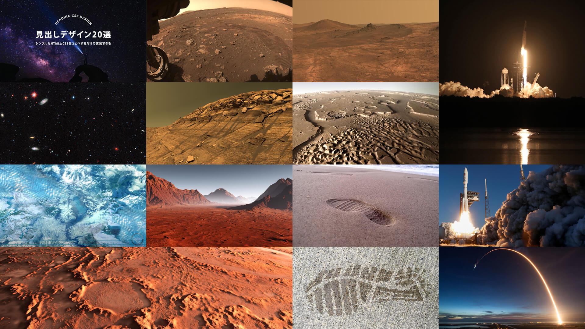
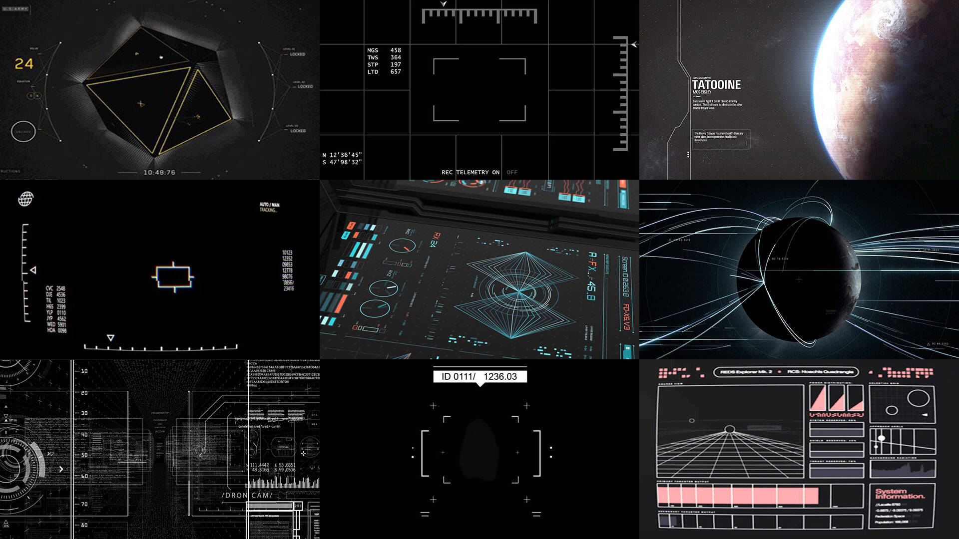
The brief for this project was that it should feel dangerous, awe-inspiring and/or cinematic, and that the show is skewed towards a male from ages 25-65. I was also provided with a logo for the show and rough cut of what the video would look like, including the script. Beyond that, it was my responsibility to determine what the project should look like. The first step I needed to take was to identify imagery that I might want to use on the frames. The process for this was to go to websites like Google Images, Pinterest and Shutterstock and search for keywords, such as “space”, “mars”, “astronaut”, “rocket”, “launch”, “planet”, “stars”, “user interface” and more.
As I began to see images, I came up with ideas for different shots I would like to incorporate in the style frames. Some key themes I picked out early on were that I would like to have an astronaut with a reflection in the helmet, and imagery of the curvature of the planet in another shot. I also picked out some examples of star clusters, surface textures, rocket launches and “human influence”, such as the footprints on surfaces. The last section I research was user interface (UI) elements; as this was a scientific, space show, it felt pertinent to use UI elements on the frames to represent the technical aspect of space travel, so I wanted to find some good designs for that. I’ve included some of the images from my research below.
Once I had formed ideas through this process, it was time to start putting the pieces together in Adobe Photoshop. This is a trial and error process to take these images and crop, mask, and blend them in ways that communicate ideas and meanings. And, as these frames were being created for video, it was important to think like a motion designer and indicate motion where possible.
Designing the UI
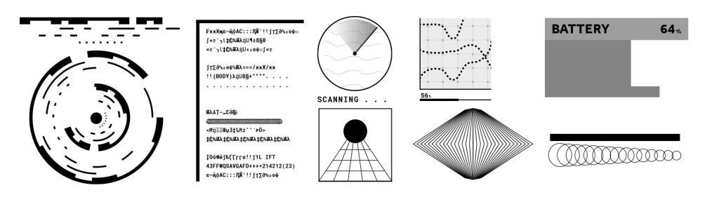
I also needed to create some UI elements for the project, which I did using Adobe Illustrator. Some techniques I used here were using the blend tool to blend between different shapes, the stroke options to create dotted lines, the rectangular grid tool to produce grid layouts and, most interestingly, the brush options. I created some interesting looking layouts and converted them to brushes, and then used that brush as the stroke for different shapes. In addition to this, I used the glyphs panel to find some technical looking characters to add a more scientific, even alien, feel to the project. I then imported these into Photoshop as smart objects.
Producing Frame Options
I chose to work on two different designs, in order to display different ways in which the piece could be designed. For my first design, I began by creating the ideas I had formed during the research; I wanted to make an astronaut’s helmet with a reflection of Mars in it, but also give a hint of the person in the space suit to represent the human element better than an empty reflection would. I also wanted a frame which showed the scale difference between the astronaut and the planet, so I decided to use an image of the planet’s curvature alongside a floating astronaut, which had a similar feel to some of my reference images. I opted for a red and black colour theme for logical reasons: Mars is the red planet and space is black.
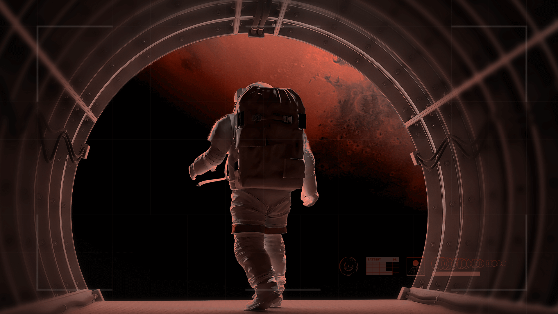
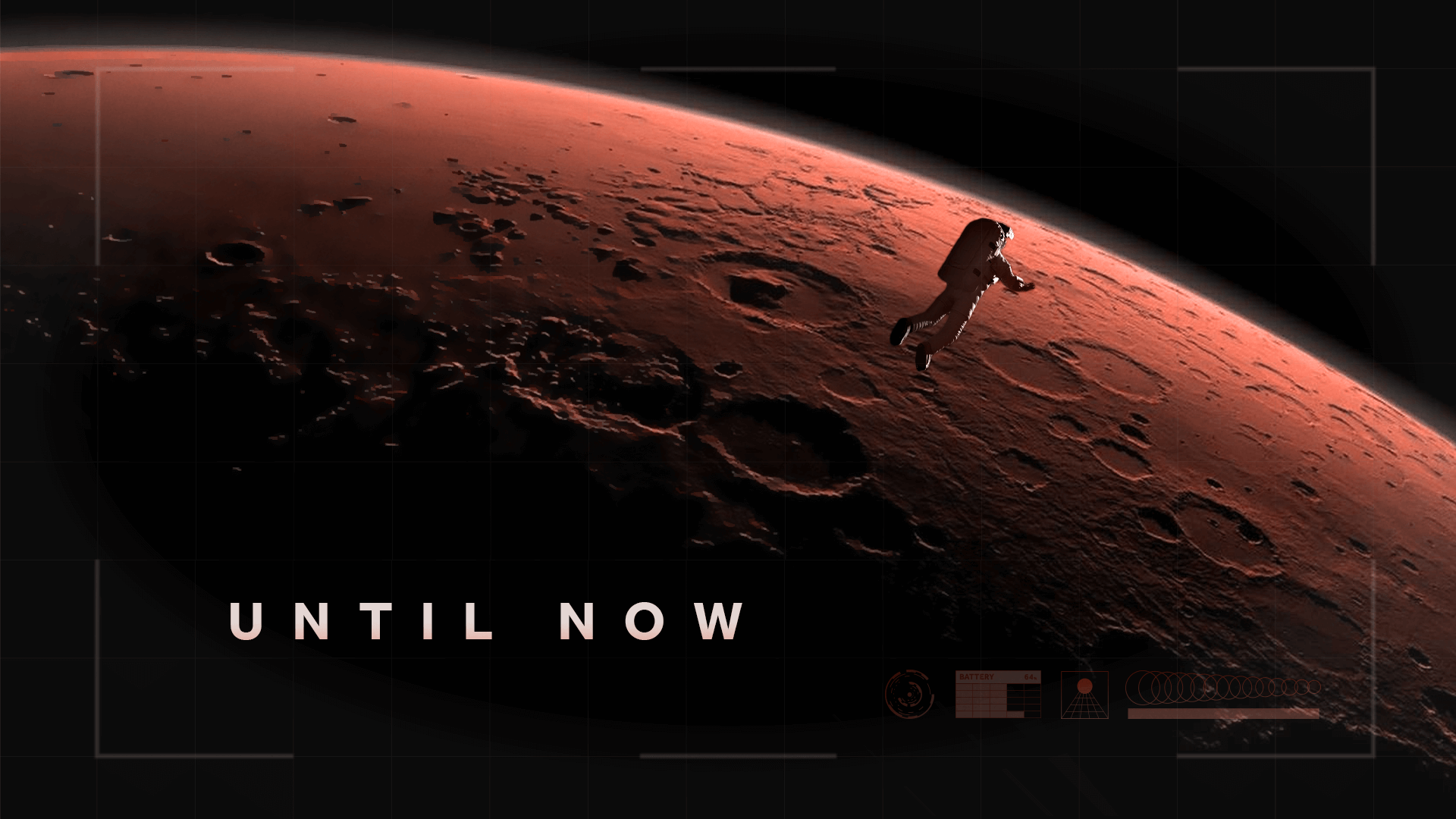
In terms of design, I was really pleased with how these images came out; they look visually cinematic and awe-inspiring, and it isn’t obvious that the images are actually several images which have been composited and stylised. It also implies motion and a story in just three frames, telling the viewer about an astronaut’s travel towards Mars. The issues with these initial frames were that they were drawing the viewer’s eye to different areas of the screen; frame two has the text “until now” in the bottom-left corner whilst the astronaut is top-right, and frame three has the astronaut’s eyes at the top of the frame whilst the show title was at the bottom of the frame. I also felt as I was making the title frame that the text was too cramped in that section.
For my second set of frames, I wanted a different colour palate to the one I’d used in the first option. It was tricky to choose a palate for this project that didn’t include red and black, as those are the real colours of the central focus for the project, and making the planet green might look a bit strange. So, for these frames, I chose a dusty yellow colour after trying some oranges and yellows, which I felt represented a desert and evoked a more dangerous feeling. I then chose a blue accent colour for the other sections. For these frames, I wanted to show a path being travelled through lines around the scenery, similar to one of my reference images. I took pictures of the planet from afar and closer up, adding these lines throughout the piece. I used more UI elements and added scanlines as a texture, with the hope of evoking a similar feeling to the 1960s/70s space travel on older home TVs.
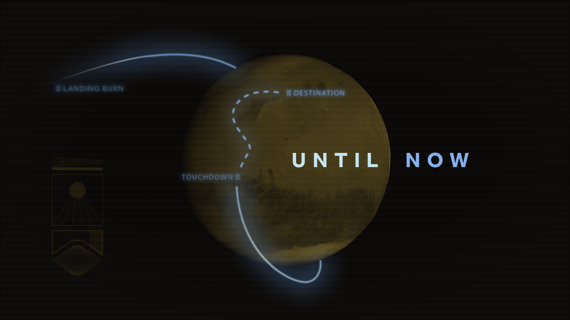
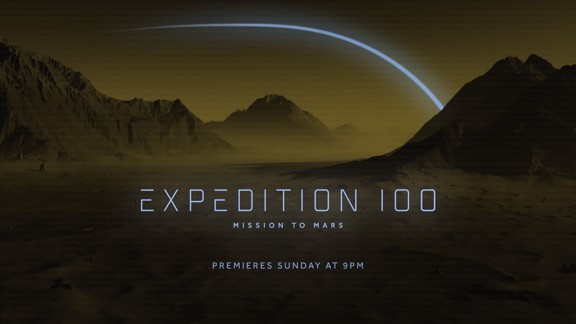
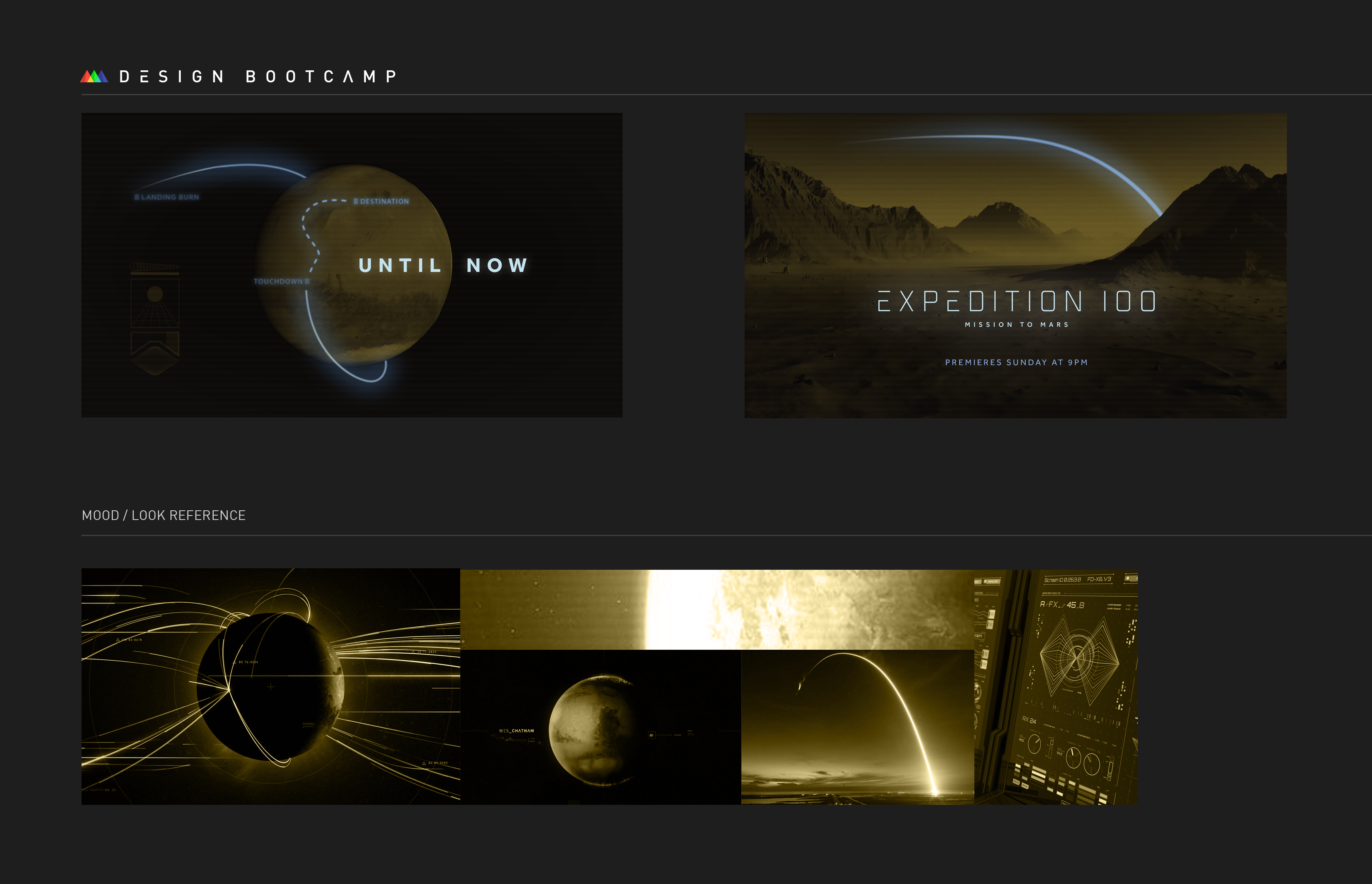
In these boards, I liked the paths I created to represent the direction of travel by the space explorers and indicate some motion. The small points of light within the dark frames could represent hope and discovery, and the contrast draws the viewers eye to them well. I also like the yellow colour, and especially how I stylised the second frame with it. One challenge I had with these frames was that the browny-yellow colours from the second frame were hard to represent in the first frame, as changing the space background to be anything but black would result in it looking less like a planet – but that would likely be less of an issue in a full set of boards. I also wasn’t sure whether to blur or sharpen the blue lines, ultimately deciding to blur them. When they were sharper, they drew the viewer’s eye to them strongly, but blurring them felt like a quality reduction, so it was a tricky line to walk.
Finishing the Set
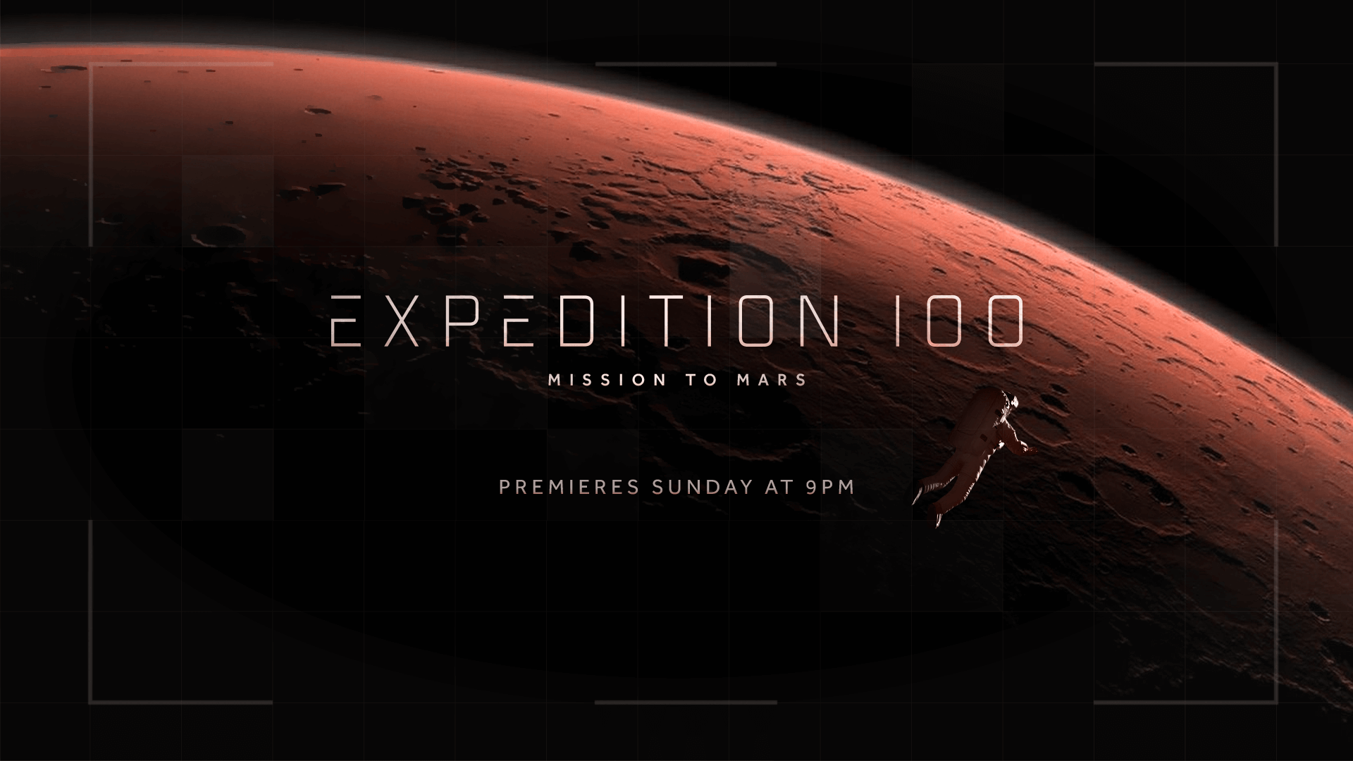
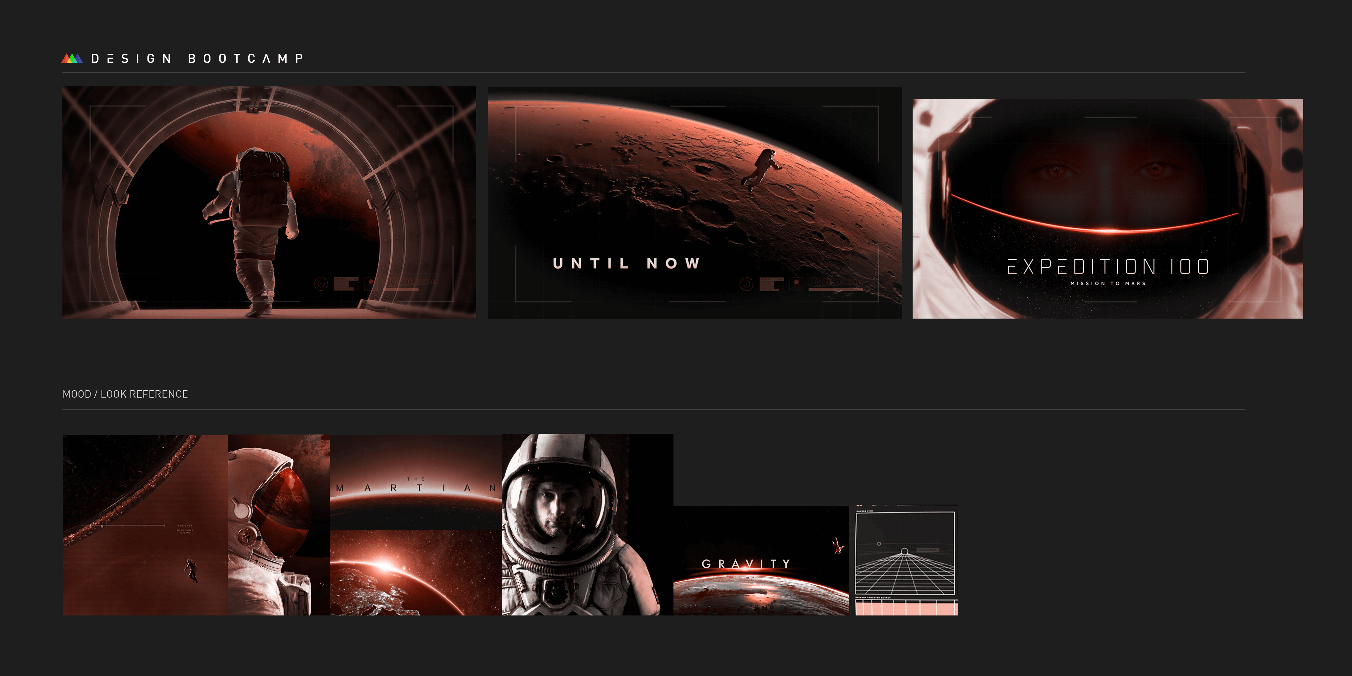
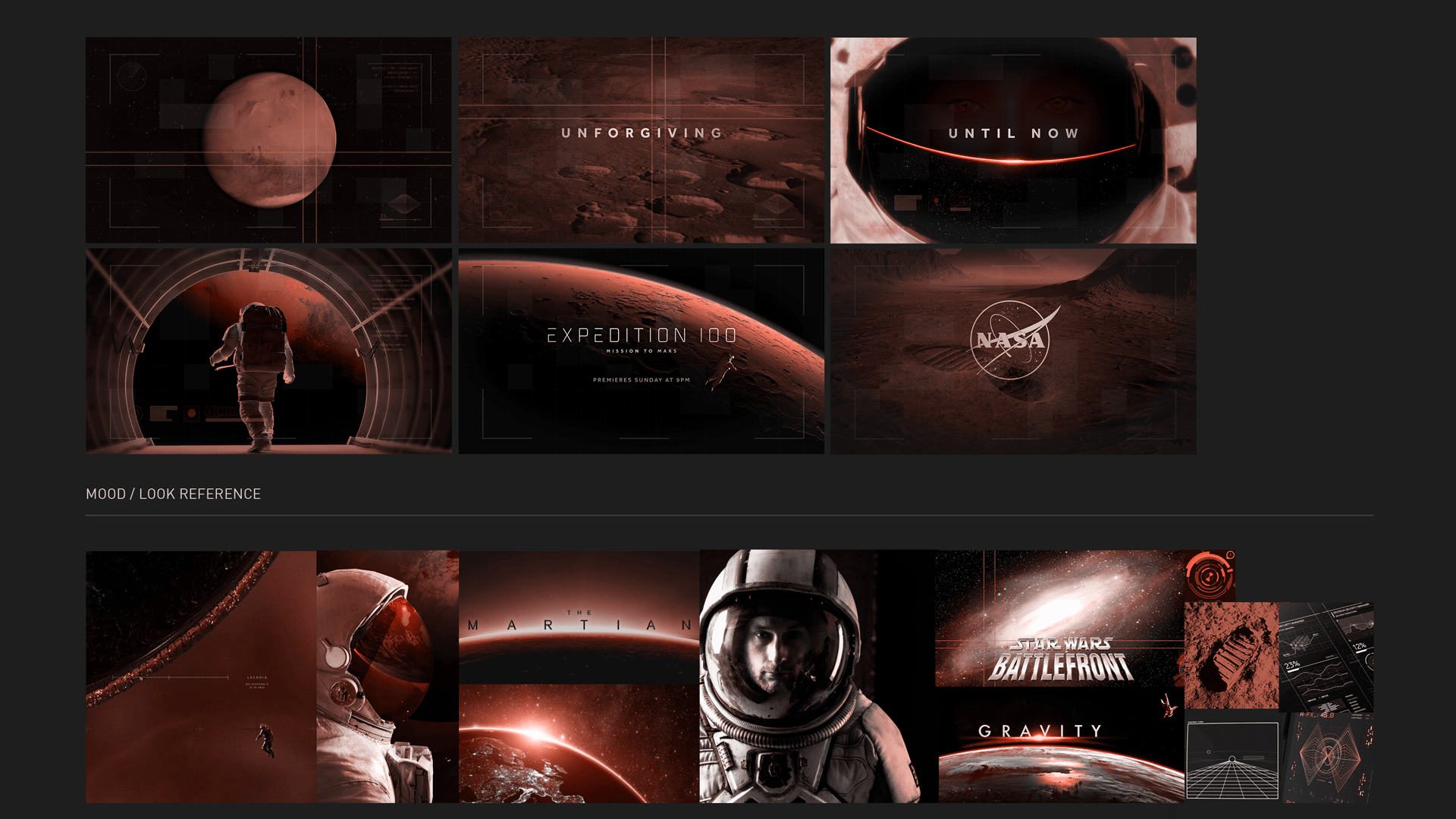
In the end, I opted to go for the first option I created to produce the full set of six frames for the project as I felt I had a clearer idea of how I wanted that set to move and that the original frames for that set were nicer.
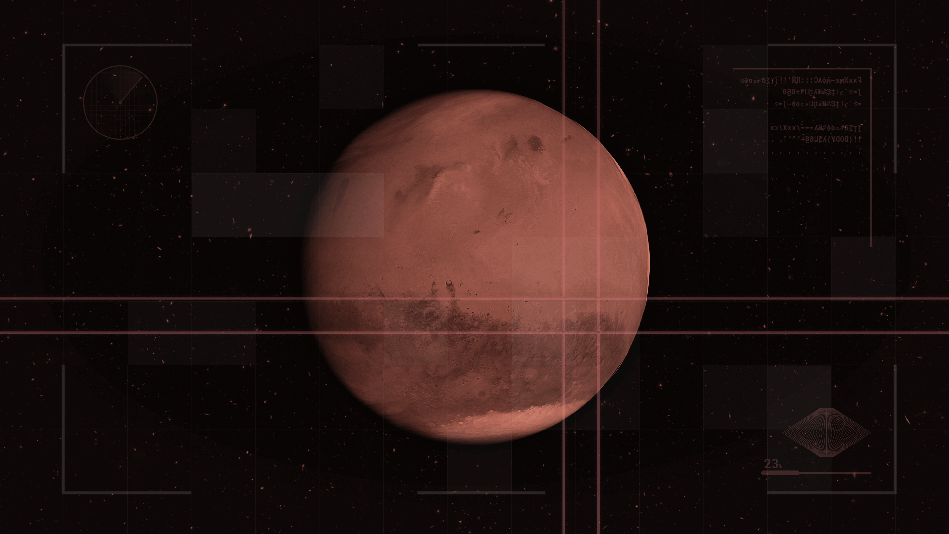
For the first frame, I took the Mars shot I used in the other frame, recoloured it to match the rest of this design and added various UI elements. I also resolved my problem with the background by finding a nice picture of stars in space and using that as the background. The lines on the planet are used to signify a point of interest and imply that it will go to that point, to indicate the motion, similar to one of my reference pictures. I built upon the UI grid I created for the previous set and finalised it, adding in some patches of squares and moving some elements around the frame.
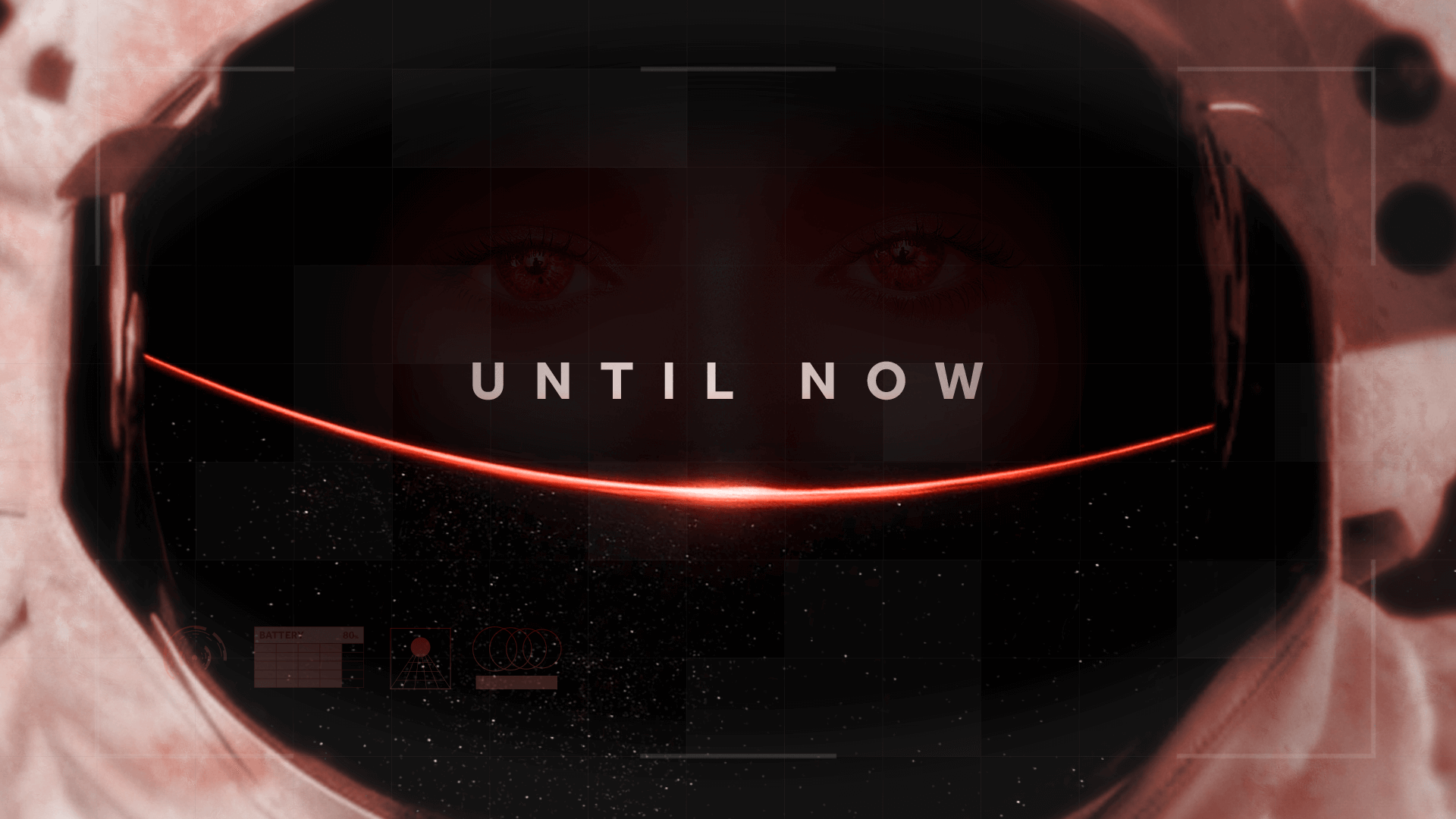
The second frame is a continuation of the first, with it showing the zoomed in point and then repeating the line animation to select another area to zoom in on. This frame also had the first introduction of text, which I coloured white for good contrast and accessibility, but also added a red tint to blend it slightly with the background. This frame was the trickiest of them as I was attempting to blend various pictures of Mars together, which was difficult to do when they were all taken from different angles relative to the ground. If I did this frame again, I would also add some implied animation to the text to indicate how it is revealed on screen, perhaps changing the scale or the position of some of the letters slightly.
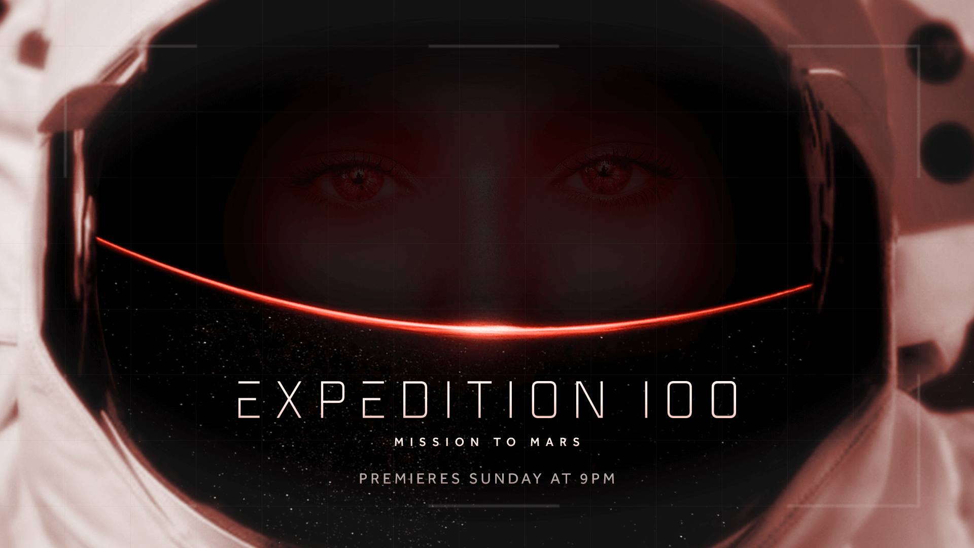
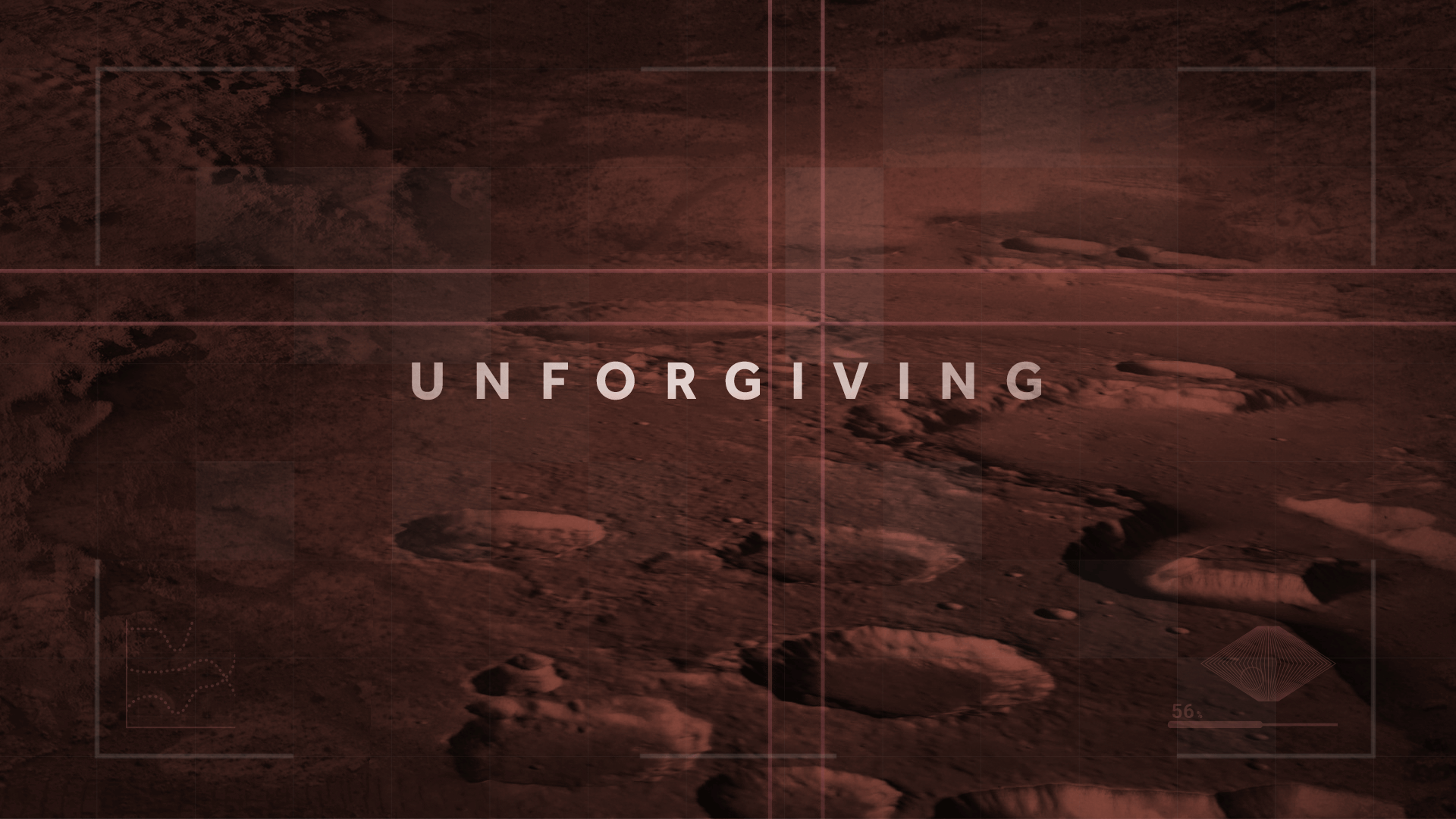
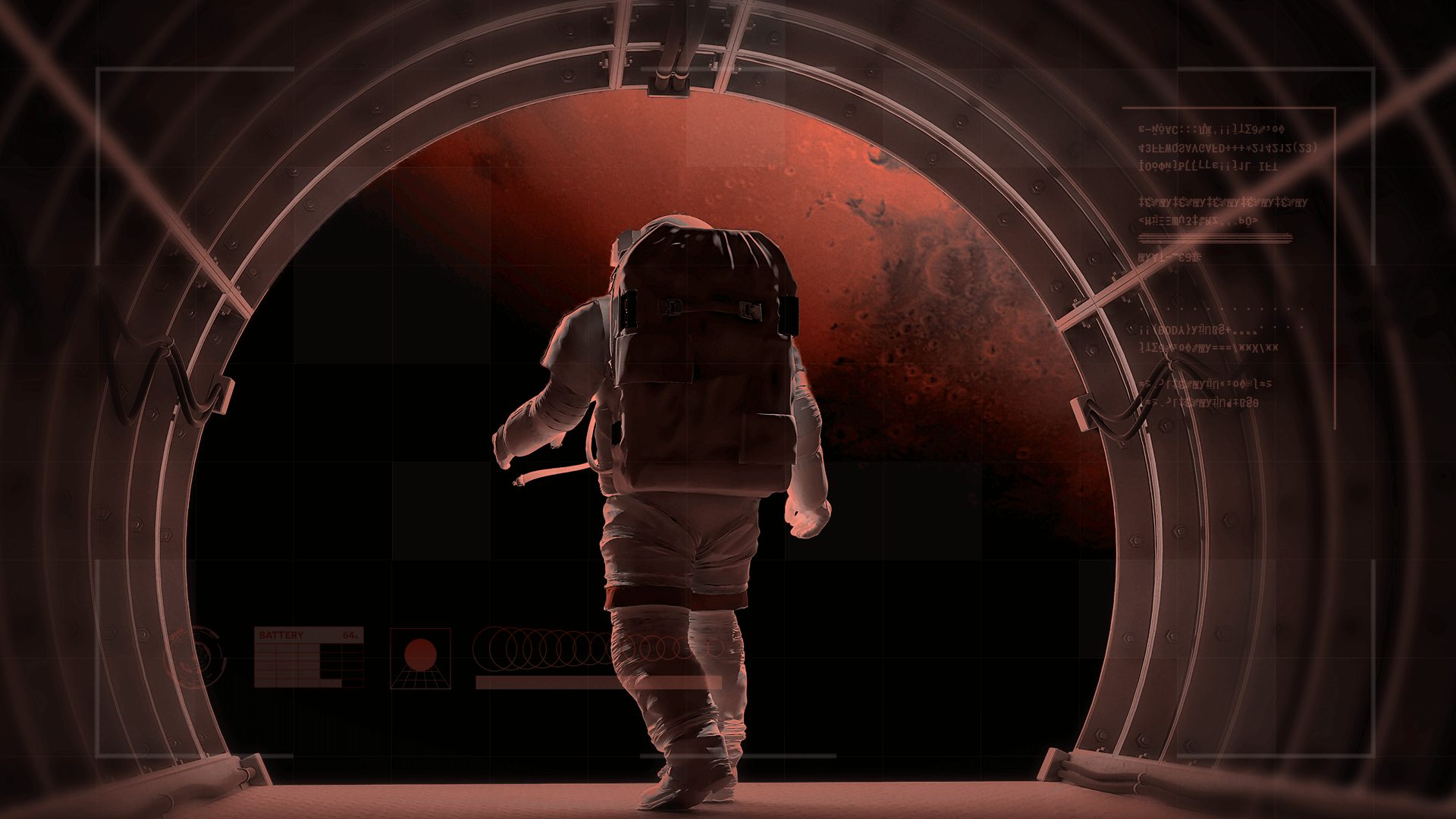
The third, fourth and fifth frames were revisions of the frames from my earlier work. Due to the issue I had with the spacing available for the show title on the frame I chose, I decided to re-order the frames as I felt it would be impossible to make that frame work as the title frame without drastically changing it. I didn’t feel that I could put text on what is now the fourth frame without it looking strange though, as the astronaut would need to be overlaid with text, so I chose to keep text on the third frame but move it closer to the eyes, fixing the issue of different focus points. I moved the title to the fifth slide where I was able to freely centre it and, once again, fix the issue of the focus point by moving the astronaut near to the title. In all of these slides, I made some changes to the to the UI layout and some minor changes to the design to help with contrast issues.
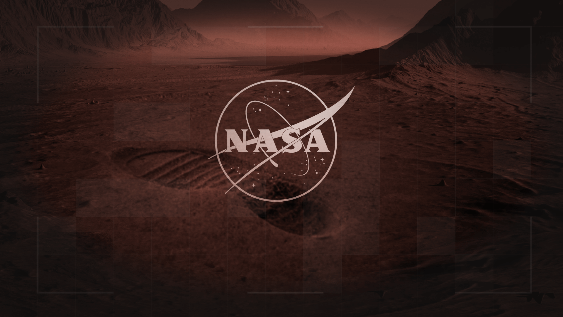
The final frame ended up being my favourite of the collection. For this frame, I re-used the image I liked from my previous set of boards but zoomed in on it, as I wanted the ground to be the focus. I knew from the beginning of the project that I wanted to have something showing that humans were on Mars, and I went with a footprint as my chosen method. I was able to blend the footprint into the surface through masking and colour correction adjustments to the point where it isn’t obvious at all that they aren’t part of the same image. The curvature of the footprint also fits in well with the background, making it look like a small hill. This slide needed to include the NASA logo, so I chose an outline version in order to let the viewer see more of the background, and I applied the same colour adjustments that I had used on the text.
Final Thoughts
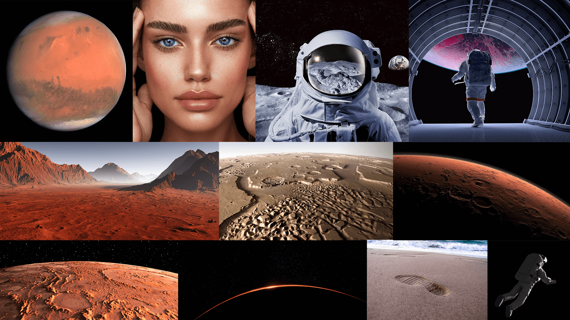
Above this paragraph, you can see the final boards, the image references and then the images I used in the piece next to them, which are interesting to look at and see how they’ve been composited in each of the frames. Overall, I was really pleased with how these frames turned out and enjoyed working on the project. I learnt a lot about blending images together and also about choosing focus points on images, leading the viewer’s eye to the position you want them to look at. At the core of this work was the fact that it was a motion design course, so telling a clearly moving story through different images was an important part of the process, and thinking about it as an animator helped to make story and a theme of movement.
