The Messagerimus website allows users to send an email at a future date of their choosing, with a few different settings for how they can do so. In order to explain the process, they provided a a series of images at the top of the page that users could watch, and you can see that GIF beside this text. However, they wanted a video to explain it in a more visually appealing way for their users, and you can see the final video above.
Below, I’ve explained how I went through the process of creating the new video.
1. Scripting
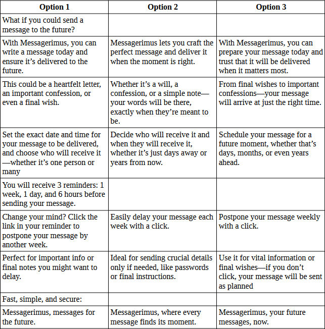
The first part of this project was to figure out what needs to be said. Using the GIF above was a good blueprint for that, but there were also some additional bits mentioned on the site and then how it can be said in a more appealing way. I started by breaking down the existing GIF into each section of the story and created my initial script using that. From there, I used the somewhat controversial ChatGPT to help me generate different ways of saying each section to help generate ideas for how I could tell the same story differently. Once I had the three routes, I picked out what I felt was working best and combined them into one final script, which I approved with the client before proceeding.
2. Storyboarding
Once the script was confirmed, I began to produce a storyboard for the project. My preference for doing this is to begin by laying out the script contents into different boards within Illustrator, so I can see the whole project at a glance. From there, it was about generating ideas that fit in each section. For some of these sections, I had already naturally had ideas, whilst others needed more research to conceptualise.
I knew I wanted to begin with an envelope to fit with the current branding on the website, and my plan was to start with a message that zooms out into a letter going into an envelope. After that, it was about finding ways to transition from the text into the next scene.
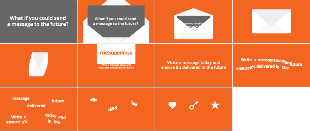
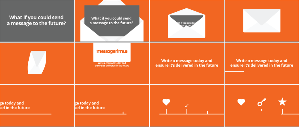
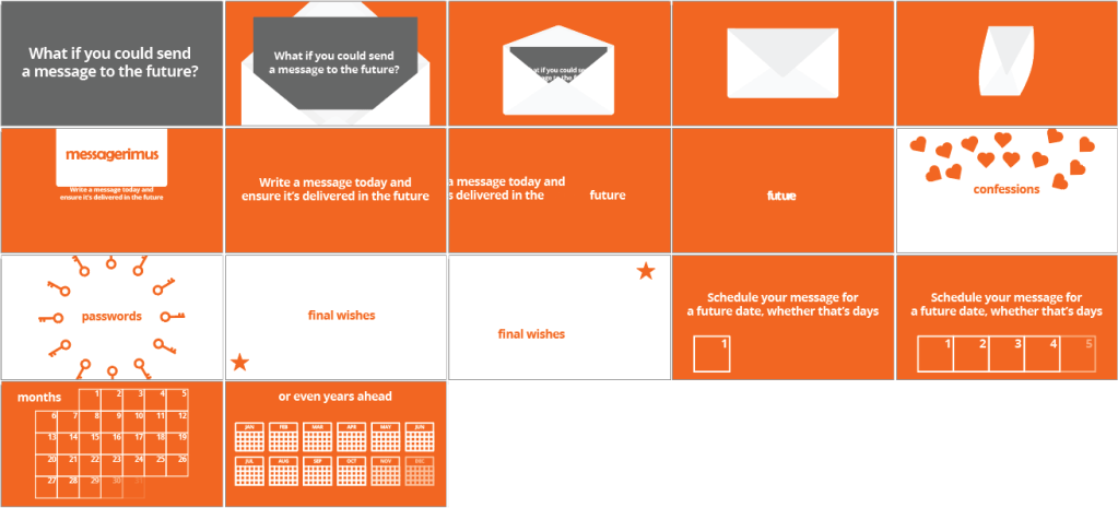
I tried a few options – picking out some key words and transforming them into the shapes I’d selected for the next scene, or using a line progressing from left to right to represent a forward movement. I also tried changing the background colour of the scene, which felt like the best option of the three.
However, it felt like this still wasn’t really working, so I went back to the beginning and had another look at the script. It felt like the order of the script wasn’t really working, and that the important information of how the process worked would be better to be supplied earlier on that examples of its use. This allowed me to move the calendar design I’d created earlier forward and link it to the idea of the line moving forward. I completed the final storyboard and send it to the client to confirm.

For ideas, I would use search engines to look up ideas for sections I planned to use and then used Eagle to store references. For example, for the envelope closing and turning, I wanted to find some good ideas of how I could do this. Creating a bank of images was helpful for crafting the look and feel of elements like this – I knew from my research that I wanted my envelope to have a bit of a bend to it, rather than feeling like too stiff of an object.
3. Final Storyboard
Once the storyboard was approved, it was time to create the final assets I would import into After Effects. The storyboard above was a rough design, showing what the elements would be intended to look like and how they would move, but now I wanted to add polish to them and really consider how it would work to animate between each section.
I started by adding some gradients, vignettes, and shadows to the elements, to give them a bit more depth and remove some of the flatness of the images. I considered adding textures and grain but did a few animation tests and it didn’t feel appropriate, so I left those off. For the envelope, I brought in the pattern that was being used on the website to make it feel more relevant. The client asked to replace the “passwords” section with “important notes”, so I updated that and created a design of paper falling. I also made the circles in the reminder section look more like 3D spheres.
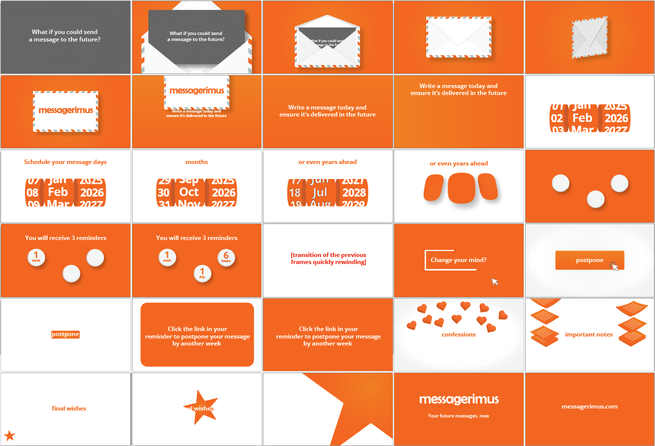
But the biggest change was to the date selection section. When I was considering how this would be animated, the length of time it would have to be on screen versus how much text there was for this section, it didn’t seem like it was going to work. So I had to think of another idea for this section. I came up with the idea of a spinning date wheel, which I could easily change the date on quickly as the words in the section were being displayed, rather than trying to build a whole new calendar each time.
4. Animation
It was now time to build the animation in After Effects. I began at the beginning of the storyboard and imported each element from Illustrator using the Overlord plugin – an essential part of every animation project and shockingly still not a feature Adobe has built in to the software.

I built the project in five separate pre-comps to give me more flexibility in moving things around or changing them at a later date. I started with the envelope composition and used the Time Displacement effect on the letter as it span in 3D to give it more of a bend to it. I then pre-rendered that composition as the loading times began to get quite slow.

For the wheel, I created three compositions with each of the days, months and years, and then I used the CC Cylinder effect to turn it into a spinning wheel. This wasn’t quite working, so I used the “transformation sandwich” to fix the orientation of it. I also added a Warp effect to the outside wheels to give them more 3D perspective and better fit the plane of view their wheels were in.
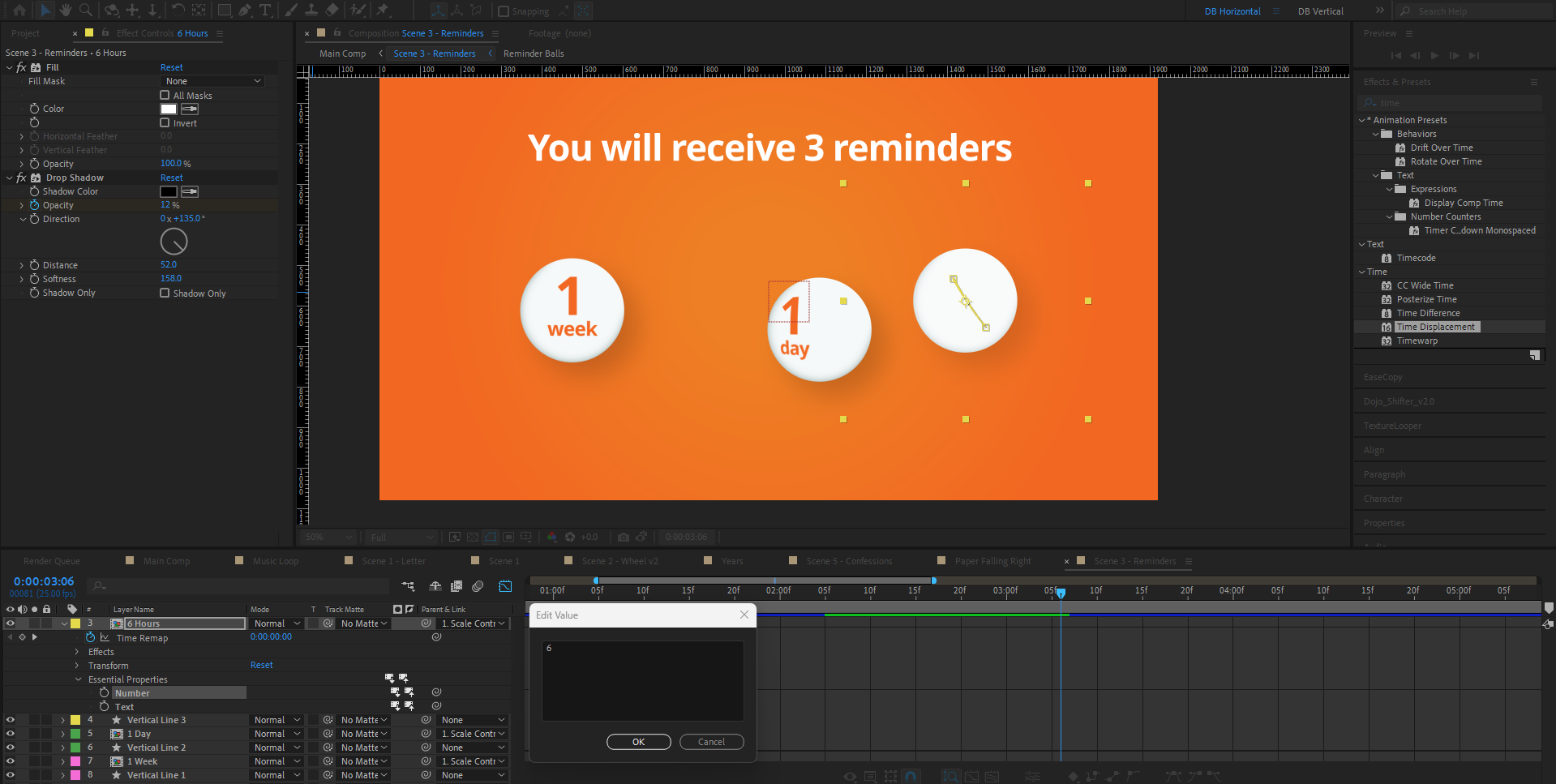
With the 3D balls, I did this using the Essential Properties panel. Rather than create three pre-comps for each ball, I built one and then added the number and text layers as essential properties. I could then edit these in the parent composition and keep my project files window a bit cleaner.
I did make some changes to the animation from the storyboard, namely regarding the rewind transition I suggested we implemented. When I animated it, it wasn’t looking very good as the clips felt too sped up. It also required a rewind-esque overlay (think VHS tape going backwards) to quickly allow the watcher to understand what was going on, and designing and animating that was looking like being a project on its own. The client wasn’t wedded to that idea, so I swapped it out for a simple match cut and saved a lot of time!
5. Audio
Once the video was completed, I suggested to the client that it might have more appeal if it were to have a voiceover on it. Initially, that wasn’t part of the scope of the project, so I had designed it all in a way that it could be watched and understood without it – which is always good to do even if there is a voice over as anyone without audio can’t follow along otherwise. The client agreed to add a voice over, so I recorded one for it.
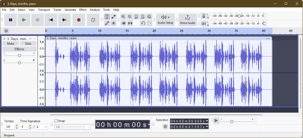
I used Audacity to record the voice over and opened up the script for reference. I recorded each line into separate files and did around 7-10 takes for each line, in case there were problems with any of them. I also intonated them differently here and there just to give myself some options in getting the right feeling to the voice. The benefit of doing so many takes and some with variation was that, when I brought the files into After Effects, I could cut them up very finely, sometimes even using only single words from different takes where the recording was the best option.

Finally, to give the spaces between the voiceover some life, I added a repeating loop of a song from YouTube’s free audio library to fill the gaps.
Final Thoughts
This was a great project to work on as I had a lot of creative control and the client was very friendly and good to work with. Taking the project all the way from scripting to final video gives you a great feeling of ownership of the project and I’m proud of the video I’ve produced. The client was also very happy with the work and was kind enough to leave a LinkedIn recommendation on my profile following it.
Overall, the project was a great success and I’m looking forward to seeing how the video performs as marketing campaigns begin on the website. Here’s another look at the video now we know everything that went into it.
