Having worked with BCL before, I was approached by them again regarding their annual competitive gaming competition and the possibility of making graphics and animations for that. They liked what I had done for their sister community, BFH, and wanted to build upon that for their own stream. I accepted the project as I thought it would be a good learning opportunity and also a way to showcase the skills I’ve been learning over the past year – and it would probably be a lot of fun!
Before even beginning the design work for the stream, BCL were interested in creating a new logo as their old one was quite dated and not as professional as they would have liked. I had not designed a logo previously but felt confident that I could use the same skills I used to create mood boards to produce a logo. So I began by researching logos, primarily looking at designs from within the eSports community so I could find something that worked within their genre. I also included Star Wars images in my search as that is the theme of the game that the community competes on.
I took the logo designs above and began looking at ways to use them in a new design. Working in Illustrator, I started by seeing what I could do with the text as that would be essential to the design, moving it in different ways and different styles. The letters didn’t seem to have too many obvious connections though and the “L” was creating a lot of unpleasant-looking negative space around it, so I decided to then focus more on the shape of a logo and the central image of it. I started by using a shield design as they seemed very popular with a ribbon overlay for the text, but it was proving difficult to effectively fit a clone trooper helmet nicely into the space, and also to display the three letter text in a good way.
I opted to switch my focus to one of the clone trooper helmet source images I found, which I liked a lot and wanted to be the central focus. I re-draw that image and tried it in a shield, which didn’t fit well, but then used a circle similar to the spartan logo in my examples, and that fit well. If I were creating a logo for a professional group then this wouldn’t be an option as there would be copyright issues around replicating the image, but it was fine for a small gaming group. I then worked on fitting their full name into the circle, which proved difficult since the name was very large, so I had to make the text at the bottom smaller. Finally, inspired by the NASA logo, I added a black background to the centre and added some stars there, since it was space themed. The final result in comparison to the old logo can be seen below.
Once I had the logo in place, it was time to build the in-game overlay. I did a lot of research on different overlays used by other eSports to get a feel for what the most successful way of displaying the information on screen was. The best-looking ones were generally the ones which took up the least amount of space on the screen, and I picked out a selection below.
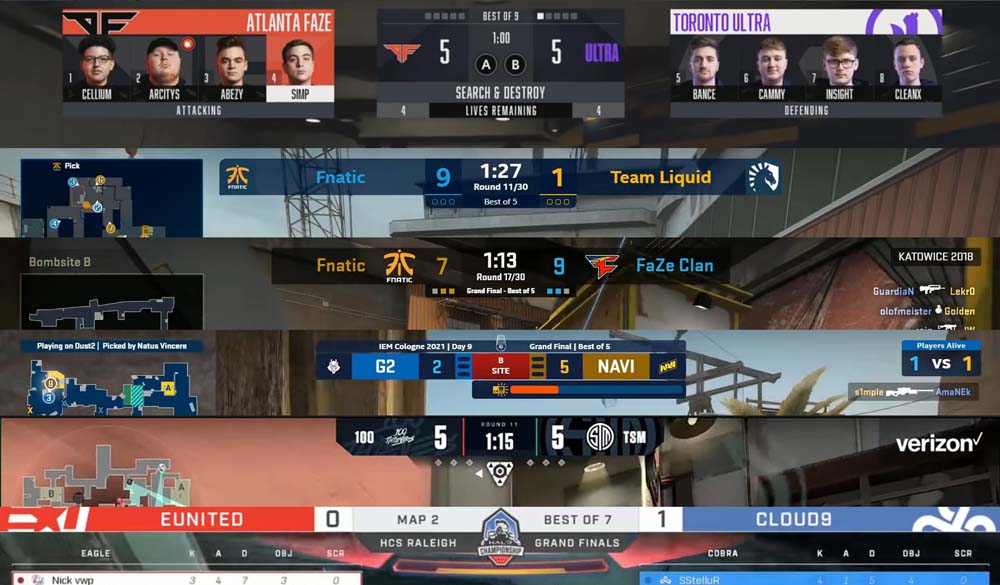

I discussed these with BCL and we came to the conclusion that the Rocket League overlay style (second overlay on the second image) was the nicest one, so I set about building something in a similar style that could be used for the BCL stream. The end result was a similar version of the overlay but styled differently in order to fit in what BCL needed, including their new logo and the match information below the main section.
I was also asked if I could incorporate the player names in the game on to the overlay. The community had produced a statistics program for displaying this information, but it had previously displayed as a spreadsheet cropped on the screen and wasn’t very visually appealing. I worked with the creator of the program to make something better for the new stream and used my previous overlay research as examples for how this could be done. The final overlay can be seen below.
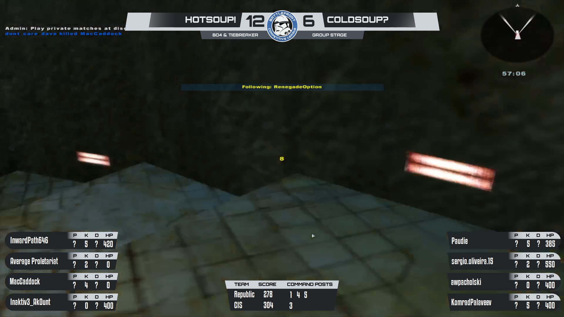
Creating this required me to work within OBS (Open Broadcast Studio) to turn the information I had from the statistics program into a series of windows, cropping them down to specific parts and laying them out over the overlay I had created. This allowed everything to be updated in via OBS and meant that no further work within Illustrator would be required to e.g. change a team’s name or to hide/show different numbers of players.

Once that was complete, I needed to create two other screens: one for the match information and one for the pick/ban phase. As with each part so far, I began by researching similar layouts for each of the sections and deciding how I could best get the information on screen. The finished overlay can be seen below – note that some sections are sped up to make the video shorter.
Looking at the beginning screen first, this section needed to include information about the two teams, the maps they were playing, the score, the name of the tournament, a video highlights box and a previous results section; quite a lot of sections. I looked up a range of different types of stream ‘introduction’ sections but it was difficult to find any real examples, so this screen was largely costumed designed based on what I felt worked well. I included several bits of animation on this section: the arrows moving in the background, which were just masks moving across texture layers, the logo rotating in 3D, with some anticipation and overshoot on it, and the zig-zag pattern very slowly scrolling down. The first two were animated in After Effects, but OBS included a feature to scroll an image, so I used that for the repeating pattern to reduce the overall file size of the overlay.
Following on from that section, I created the picks and bans screen. In examples of these on other games, they were typically laid out as cards with an emphasis on the banned maps being banned in some way and the chosen map being more noticeable than the others. To create this, I used Photoshop and made two sets of images: the bans and the picks. For the bans, I removed some saturation from the images but left a small amount of colour in them so that they weren’t completely black and white. I added a border through a stroke and then created a small “Banned” text box in the middle. For the picks, I made a wider box and removed the saturation filter. The images for the picks needed to have the text typed in within OBS, so I left that section blank and built a text layer within OBS. Each of these could be turned on and off in OBS, as shown in the video below. I also created a placeholder card for each section to show when no map was selected, using embossed text.
Between each of these sections, I included a stinger transition. I re-used one I had made for BCL before but updated it with their new logo. I also animated some of the stars on the logo to briefly increase in size, to create a shimmering effect.
Overall, this project went really well. I was able to re-brand BCL and create a stream for them that looked far more professional than anything that they had previously used, and create it in such a way that they will hopefully be able to use it in the future for any other tournaments that they play.
