Project Zenith was an early-stage exploratory project looking at what the future of Lenor fabric softener could be, aimed at imagining a product experience more than five years ahead. The brief was intentionally open, with full creative freedom to explore a bold, futuristic visual identity that could excite internal stakeholders and help set a direction for the project.
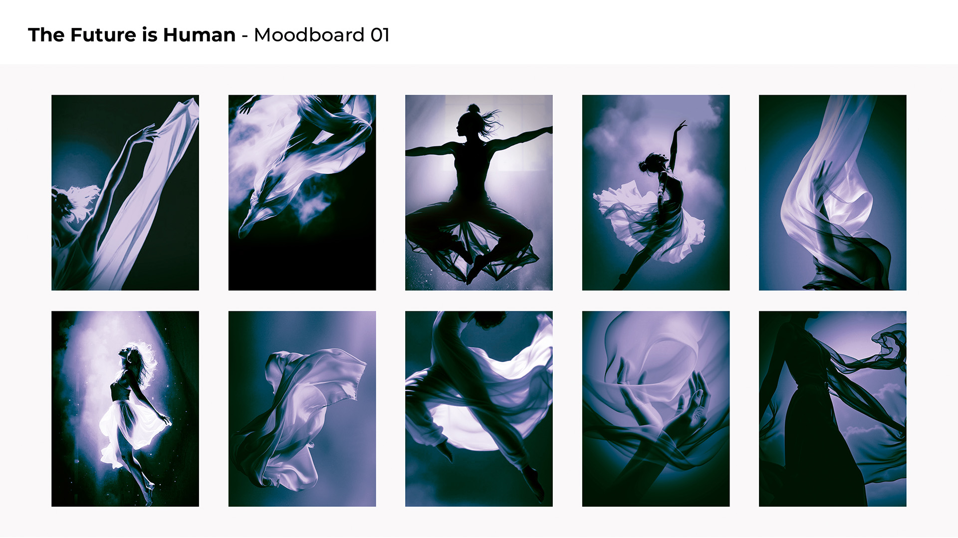
I began by creating a moodboard, using keywords taken directly from the brief to guide the visual language. From concepts like Zenith as the highest point or pinnacle, fabric softener as something weightless and delicate, and a futuristic feel described as atmospheric and ethereal, I distilled the direction down to a set of qualities that felt like they covered everything the project was trying to be: intense, characterful, soft, exciting, and futuristic.
The moodboard combined abstract imagery, lighting references, textures, and a colour palette that suggested elevation and energy without losing the softness associated with fabric care. The goal wasn’t to define a final look, but to explore a visual space that felt aspirational and forward-looking, something that could comfortably sit in a leadership presentation and spark conversation rather than lock anything down too early.
Alongside the moodboards, I explored a series of logo ideas for Project Zenith. These were developed in tandem with the visual references, pulling shapes, movement cues, and typographic ideas from the moodboards to keep everything cohesive. The focus was on creating a mark that felt premium and futuristic, without leaning on anything from the existing Lenor branding, which the brief specifically asked to move away from. Where possible, I tried to create concepts that had references to a zenith – a highest point – and there were a few possibilities with the diagonals available in the Z and N.
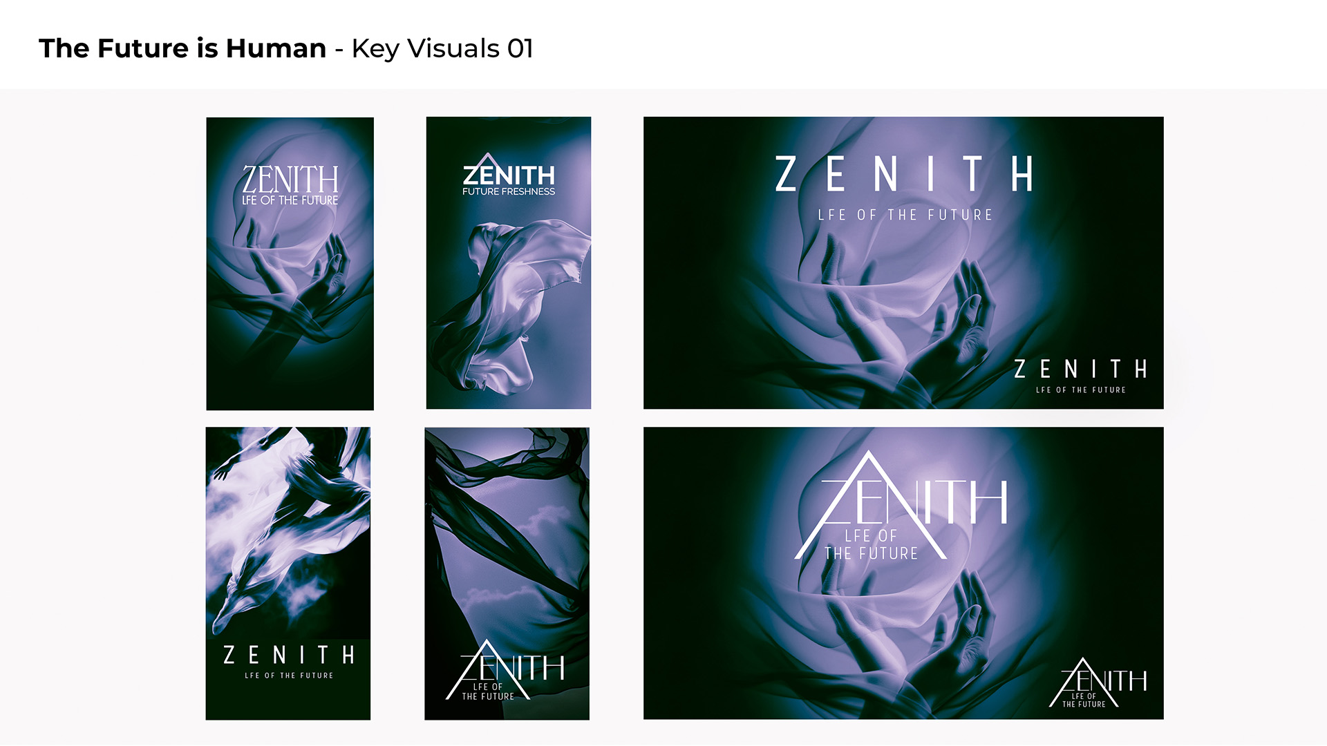
Following the logo exploration, the next step was to apply the selected marks to the existing moodboard imagery. This meant placing the logos into real visual contexts — testing scale, placement, contrast, and how the identity interacted with colour, texture, and lighting.
By combining the logos with the imagery, the work evolved into a small set of more resolved looks. These compositions helped clarify how the brand could live in the world, bridging the gap between abstract mood and a tangible visual system, and forming the final set of routes presented to the client.
